I’m so glad you’re here! Take a look around at my work in graphic design, digital art, illustration, and animation. Click on any piece to explore the story, inspiration, and techniques behind it. Every piece was created using Adobe Creative Cloud tools like Photoshop, Illustrator, and Animate, along with my big creative mind to bring it all together.
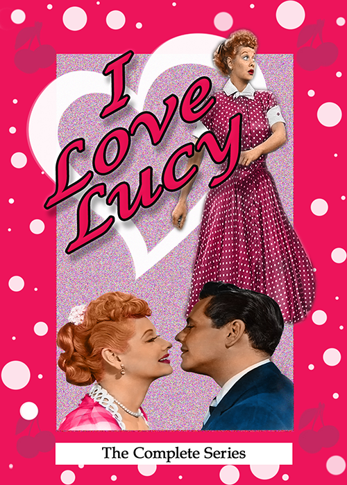


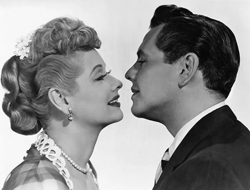
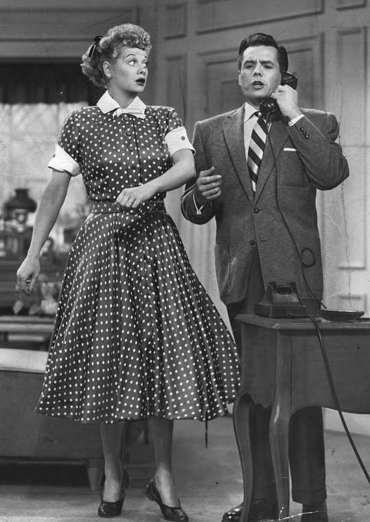
I created this DVD cover as part of a school project focused on photo colorization. For this piece, I selected the classic 1950s television show I Love Lucy, inspired by my childhood memories of watching reruns of this timeless series that I always enjoyed.
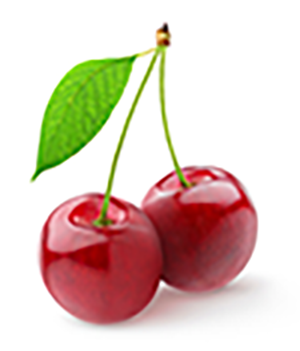
Using Adobe Photoshop, I combined the two black-and-white photos pictured below with blending and masking techniques, then hand-colorized them using the paintbrush tool. To enhance the design, I incorporated playful elements such as polka dots and created two custom brushes inspired by the cherry and heart photos pictured below. I completed the project by adding era-appropriate typography and subtle noise in the background to give the cover a cohesive, nostalgic feel.

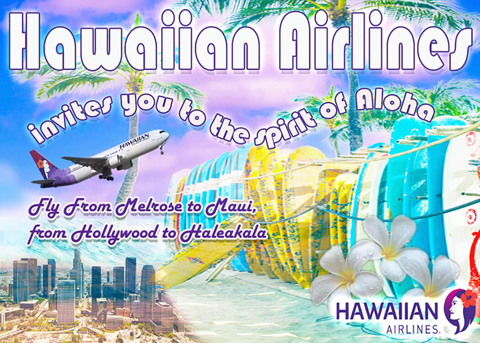
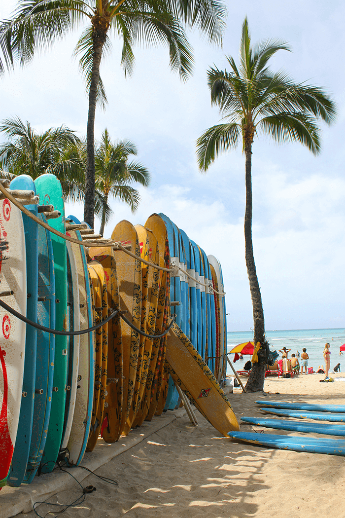
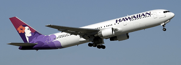
For this project, I created a Hawaiian Airlines advertisement in Photoshop designed to resemble a photo-safari style ad. I used advanced masking techniques to seamlessly combine multiple images into a single cohesive composition. To bring the design together, I applied various blending methods, adjusted opacity, and fine-tuned hues, saturation, and lighting. I also utilized the sky replacement feature to enhance the background and ensure the overall piece felt vibrant, polished, and visually engaging.


This book cover was designed for an assignment in which we were tasked with designing a cover for an existing novel based on its story, timeline, and setting. I researched the book thoroughly and used the following synopsis, found on the back cover, as the foundation for my design:
Two young women become unlikely friends during one fateful summer in Atlantic City as mysterious disappearances hit dangerously close to home. Summer has come to Atlantic City but the boardwalk is empty of tourists, the casino lights have dimmed, and two Jane Does are laid out in the marshland behind the Sunset Motel, just west of town. Only one person even knows they’re there. Meanwhile, Clara, a young boardwalk psychic, struggles to attract clients for the tarot readings that pay her rent. When she begins to experience very real and disturbing visions, she suspects they could be related to the recent cases of women gone missing in town. When Clara meets Lily, an ex-Soho art gallery girl who is working at a desolate casino spa and reeling from a personal tragedy, she thinks Lily may be able to help her. But Lily has her own demons to face. If they can put the pieces together in time, they may save another lost girl—so long as their efforts don’t attract perilous attention first. Can they break the ill-fated cycle, or will they join the other victims?
For my design, I based the cover image on a photograph of mysterious eyes, chosen to symbolize Clara, the psychic, and her haunting visions. I felt the eyes alone created just the right amount of mystery, making the viewer curious while still leaving much to the imagination. Using Photoshop, I applied a variety of selection and fill techniques to transform the photo into an abstract, layered composition that reflects the suspenseful and unsettling atmosphere of the story.

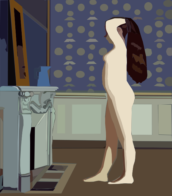
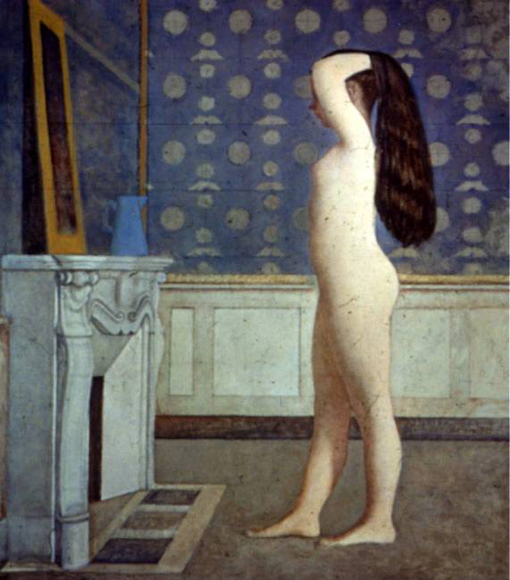
This piece was created for an assignment in color theory. I chose the famous painting My Bathus – The Nude in the Mirror (pictured below for comparison) as the inspiration. The task was to recreate a digital version of the work in an abstract style. Using Photoshop, I worked from the original as a base and carefully went over each section, making precise selections of color. I built the image in layers, starting with base tones, then adding medium and dark values before finishing with lighter highlights. My goal was to make the colors bold and vibrant so the image would truly pop, and I feel I successfully achieved that effect.
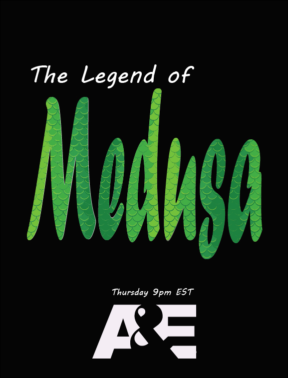
This movie poster was created for a typography class, where the challenge was to let type itself carry the design without relying on graphics. I wanted the poster to be simple yet powerful, and I chose Medusa as the subject because she has long stood out to me as a symbol of female strength and resilience. While mythology often portrays her as a monster, modern interpretations reframe her as a figure of misunderstood power and a representation of women’s defiance and endurance. To me, Medusa embodies both femininity and strength, making her a fitting inspiration for this project.
My design process began with the question: how can I represent Medusa without using literal imagery? I focused on what defines her most, the snakes. I selected a typeface with a flowing, serpentine quality, and then integrated a snake-skin pattern for texture into the lettering to suggest both beauty and danger. I kept the composition minimal, allowing the typography to become the focal point, while applying hierarchy and subtle design details to make it unmistakably a movie poster. By using type as both form and symbol, I created a poster that reflects Medusa’s myth while also celebrating the strength and complexity of women.
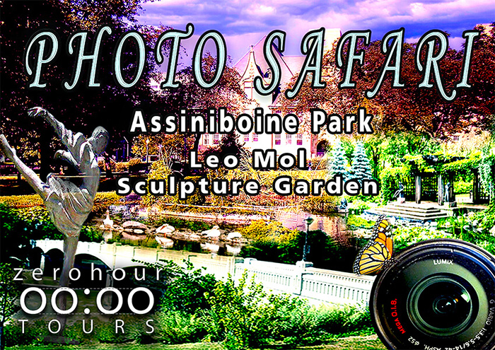
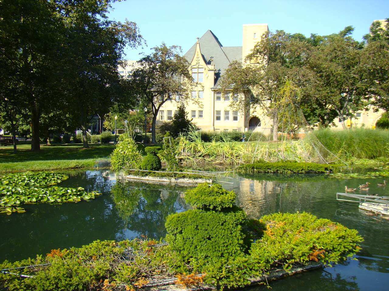
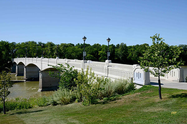
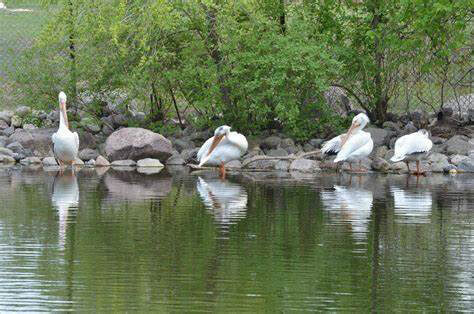
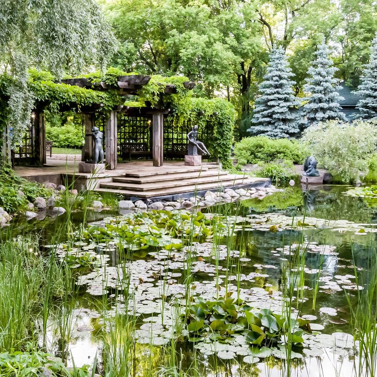
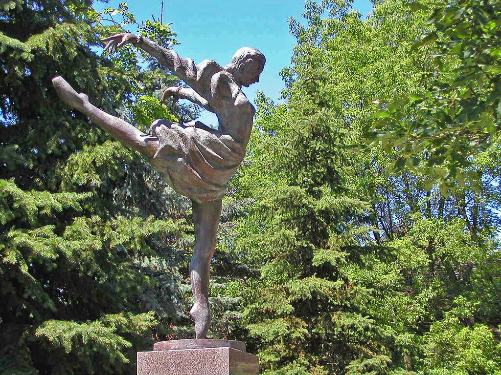
For this project, I created a “photo safari” composition using a variety of images of Assiniboine Park pictured below. I combined the photos into a cohesive scene using masking and layering techniques, carefully adjusting saturation, vibrance, and opacity levels to create a balanced and visually engaging composition. I also replaced the sky to enhance the overall atmosphere, similar to the approach I used in my Hawaiian Airlines ad. Finally, I added typography that complements the design, tying the piece together and giving it a polished, cohesive look.
This poster was designed for my son as a project to further my skills in abstract digital art. The base image was a photograph of him playing basketball, and I applied techniques similar to those I used when recreating the Bathus painting. I worked carefully, going section by section to make selections and fill each area with corresponding colors, starting with base tones, then medium shades, followed by darker colors for shadows and lighter colors for highlights, building each layer separately to create depth and dimension. I also added a complementary background, introduced subtle noise to enhance texture, and framed the composition with a border. Finally, I incorporated typography to pull the design together, creating a polished and dynamic sports poster that celebrates a proud moment for my son while showcasing my digital art skills.

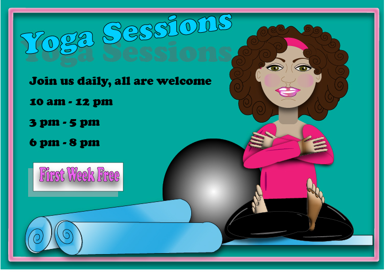
This yoga poster was created in Adobe Illustrator as a digital advertisement. The goal was to combine shapes and typography to produce a visually engaging design, applying techniques I had learned in creating and manipulating shapes as well as working with type. The project allowed me to explore composition, color, and form in a digital medium while reinforcing my Illustrator skills.
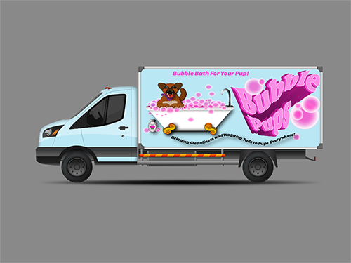
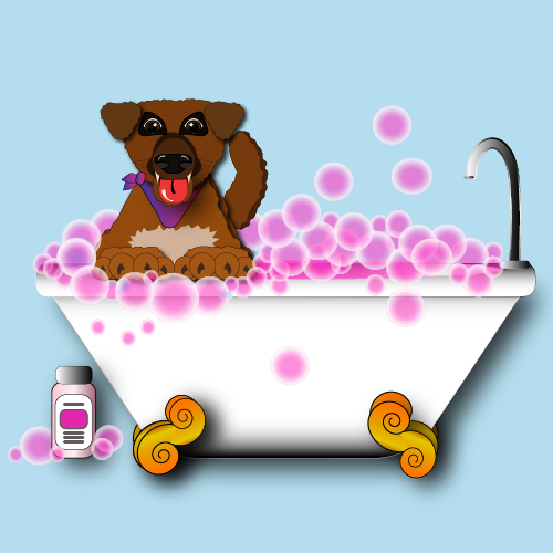
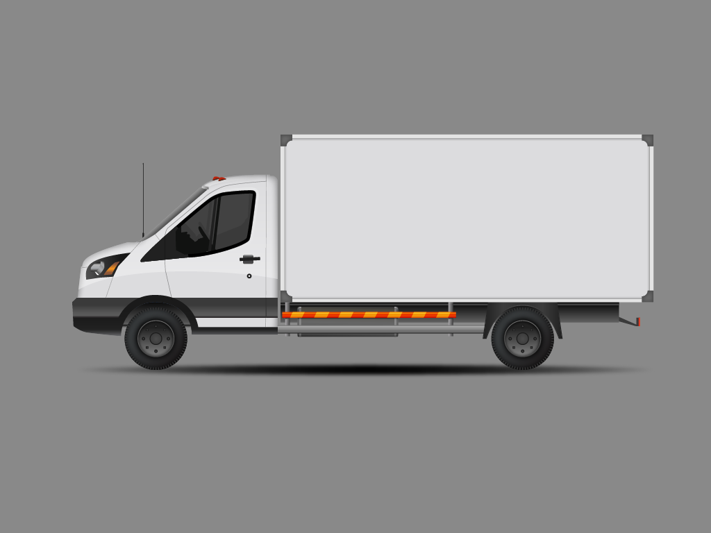
This Bubble Pups truck wrap was created as an assignment to design a vehicle wrap using the skills and techniques I learned in my Illustrator class. I designed the main illustration of a dog in a bubble bath using my own dog as the subject, constructing it piece by piece with a variety of shapes and gradients. Each element was layered carefully to build depth and dimension. Once the illustration was complete, I integrated it onto the truck design and added additional details, including bubbles and stylized typography, to create a cohesive, playful, and visually engaging vehicle wrap.

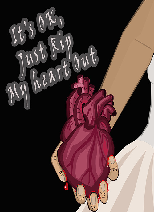
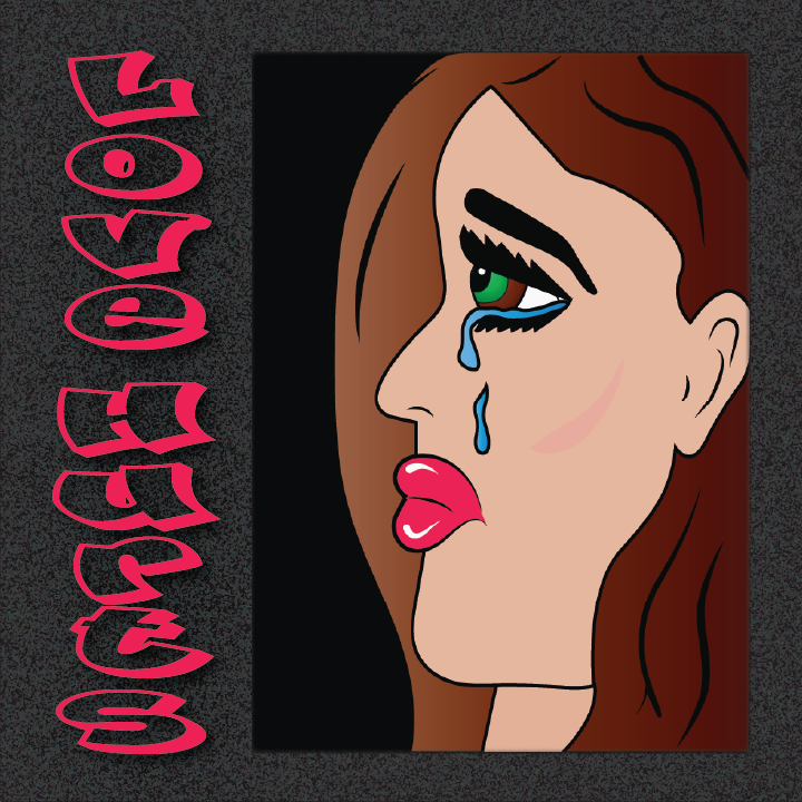
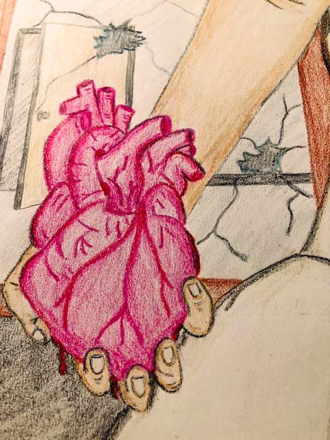
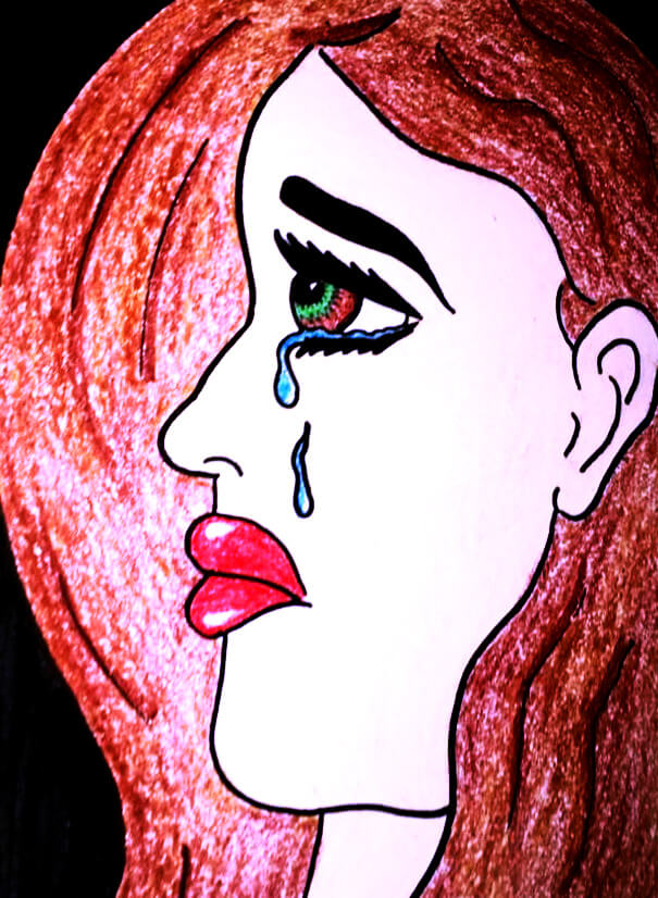
This is my digital recreation of my own drawing shown below. I created it to explore digital art techniques and expand the platforms on which I express my creativity. Using Photoshop, I rebuilt the piece layer by layer, starting with base colors, then medium tones, shadows, and highlights, and added typography that complemented the composition.
The original drawing was created during a deeply emotional time when I was feeling sad and heartbroken. As with much of my art, this work served as a therapeutic outlet, allowing me to process my emotions while expressing myself visually. Art is a central way I cope and create, and my pieces often reflect my feelings at the time of their creation.
This is a set of album cover designs created entirely in Illustrator using a variety of techniques I had learned. Inspired by a beachy, peaceful mood that I am often drawn to, I used shapes, fills, opacity adjustments, and layering to create the different effects. Each element was built step by step, layer by layer, to bring the designs together into a cohesive set.
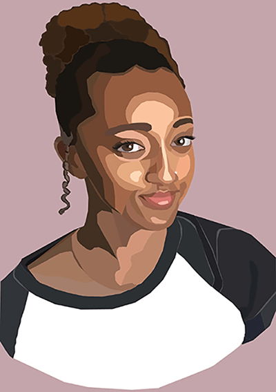
This image was created in Photoshop as a piece for my daughter. While practicing techniques I had learned, I developed a real appreciation for abstract digital art and wanted to refine my skills. Using my daughter’s photo as the base, I built the artwork layer by layer. Each section was carefully selected and filled with color, starting from a base tone and gradually adding mediums, darks, and highlights to create depth and detail, similar to the approach I used in some of my other pieces.
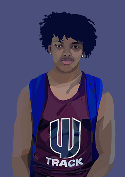
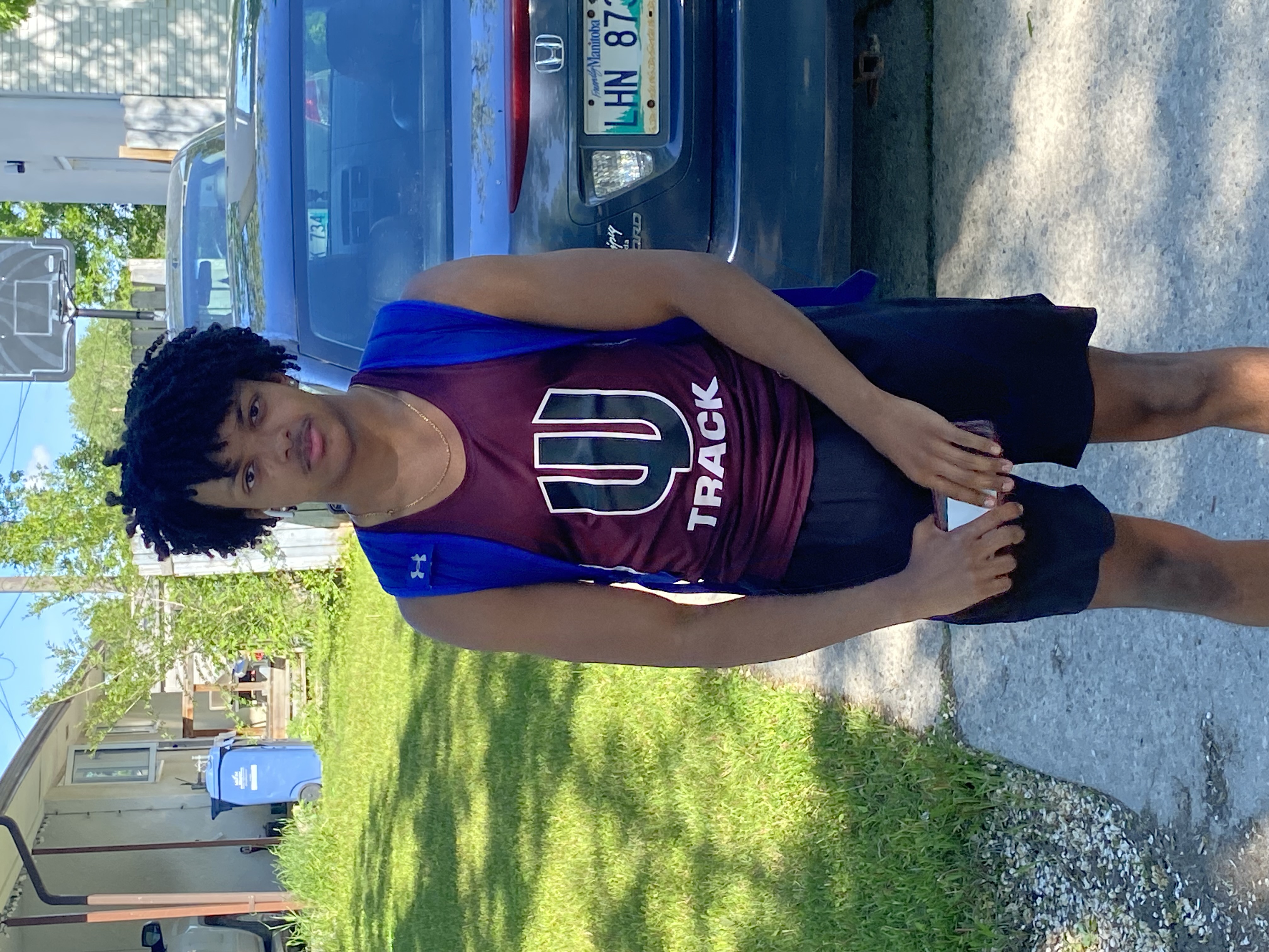
This image was created in Photoshop for my son, Luka, to celebrate his achievement of placing 2nd in a track meet. I used the same abstract digital art techniques as in my daughter’s piece and several others that I worked on, building the design layer by layer. Starting with his original photo as the base, I carefully made selections and applied color step by step—beginning with a foundation tone and gradually adding mediums, darks, and highlights to bring depth and vibrancy. This piece was both a creative practice and a personal way to capture and honor his accomplishment.
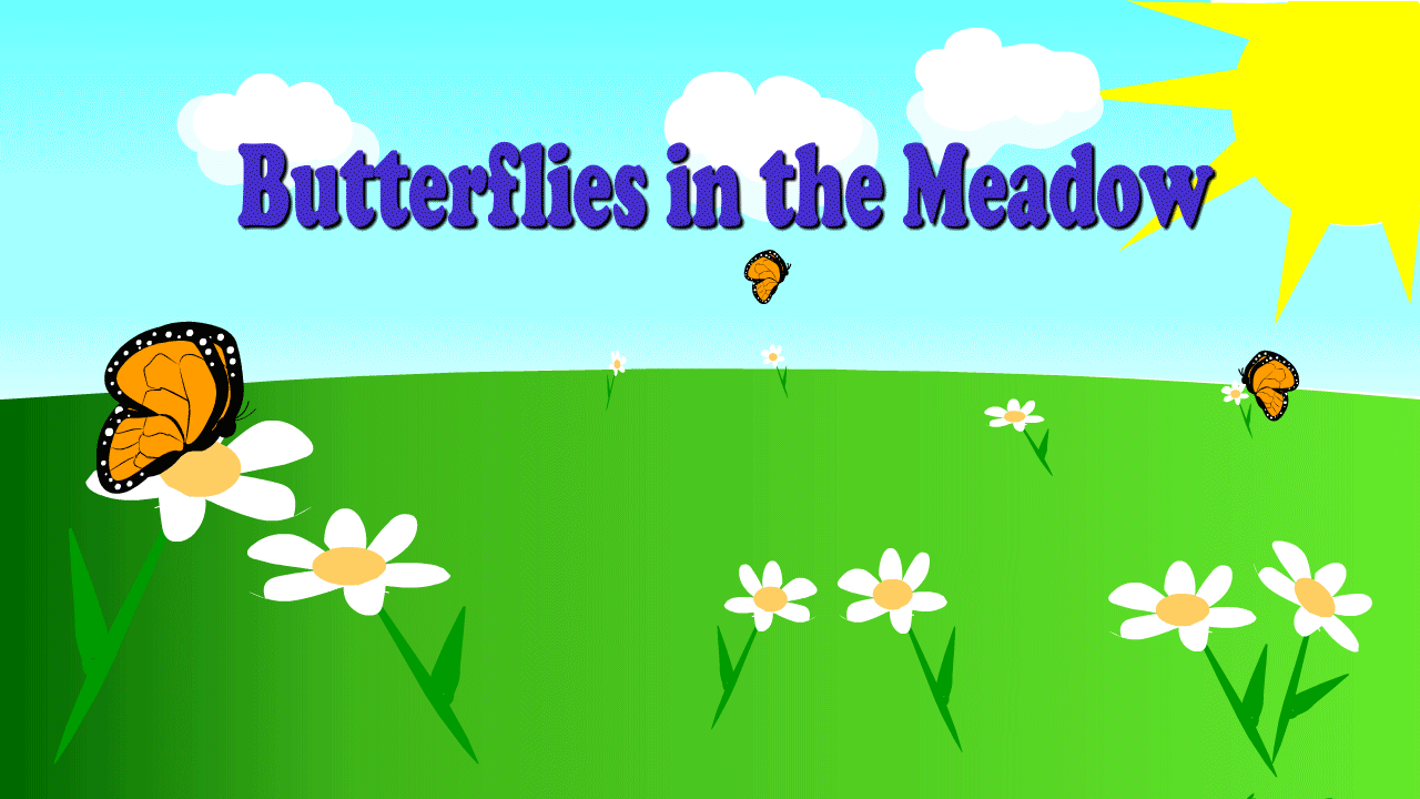
This butterfly animation was created in Adobe Animate as part of an assignment. I designed the butterfly by creating each piece separately and then assembling them together. To animate, I made the wings flap up and down using keyframes, while mapping out its flight path with the pencil tool. I also adjusted the timing frame by frame to give the butterfly smooth and natural motion. This project gave me the opportunity to combine creativity with technical skills while learning the fundamentals of animation.
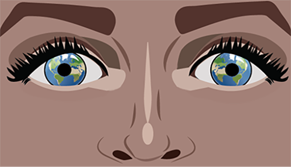
This piece was created in Illustrator as a personal expression of my connection to the divine feminine energy of Mother Earth. I’ve always felt deeply drawn to her beauty, strength, and spirituality, and this design reflects that appreciation. As a Virgo, I feel especially connected to nature and its grounding energy, which inspired me while creating this artwork. Using a combination of shapes, the pen tool, and layered composition, I pieced everything together to bring her essence to life. For me, this work serves as a reminder that beauty is universal and that Mother Earth’s energy flows within us all.
This artwork is a digital recreation of one of my original hand-drawn pieces, created during a time when I was deeply in my feelings and turned to art as my outlet. I carefully reimagined the drawing in Illustrator, using the pen tool and layered composition to bring it to life digitally. Each section was filled with care and precision, and once the illustration was complete, I added a background and complementary typography to pull the piece together. This work represents the way I transform emotion into visual expression, moving fluidly between traditional and digital mediums.
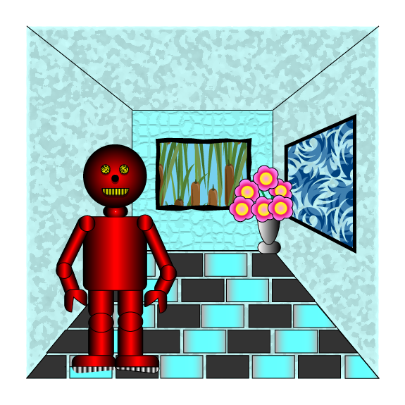
This piece is an illustration of my robot and holds a special place in my portfolio as it was my very first Illustrator project. I created it using a variety of shapes, textures, and gradients, carefully layering and arranging each element to bring the character to life. The process taught me a lot about building with precision and experimenting with Illustrator’s tools, and I was really proud of how it turned out for a first project.
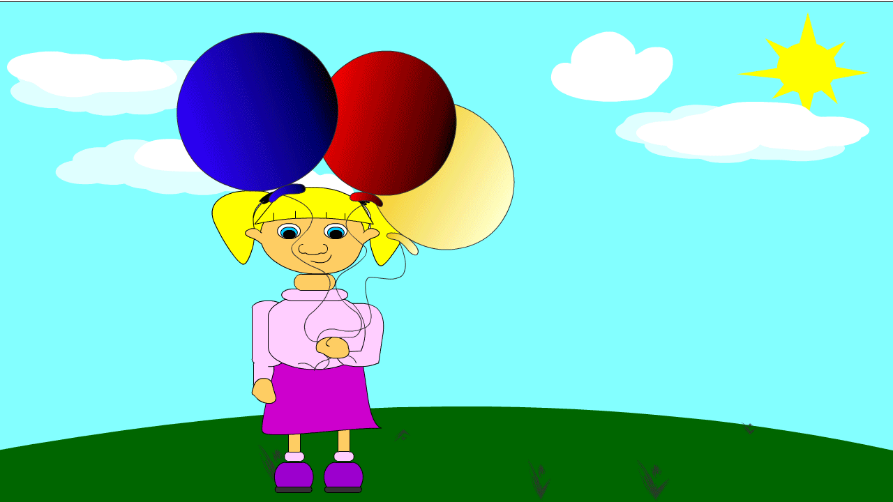
This is my Balloon Girl Animation, which I created as part of a class assignment. I wanted to design something fun and expressive that also told a simple story. The animation shows a little girl holding balloons with a happy expression, but as the balloons slip away and float into the sky, her smile slowly fades into a frown. I created the character and balloons separately in Adobe Animate and then pieced them together with careful use of keyframes and layers. I used motion paths to animate the balloons floating upward and adjusted the character’s facial features frame by frame to show the change in emotion. This project gave me the chance to practice combining storytelling with animation techniques, and I enjoyed seeing how small details could bring the character’s feelings to life.